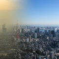
The smoke reached my kitchen before the map did.
One morning last summer I could smell woodsmoke over the coffee while my entire region sat in calm, untroubled pale blue on screen. My first thought was that the map had broken. It hadn't. I was reading a forecast as though it were a measurement, and that's the mistake almost everybody makes with these tools.
Here's what I've come to trust instead. The map on your phone and the air in your lungs answer two different questions, on two different schedules. Learn to tell those two apart and you can watch smoke move across Canada with real confidence, because smoke pays no attention whatsoever to provincial borders.
TL;DR Quick Answers
Canada Wildfires Smoke Map
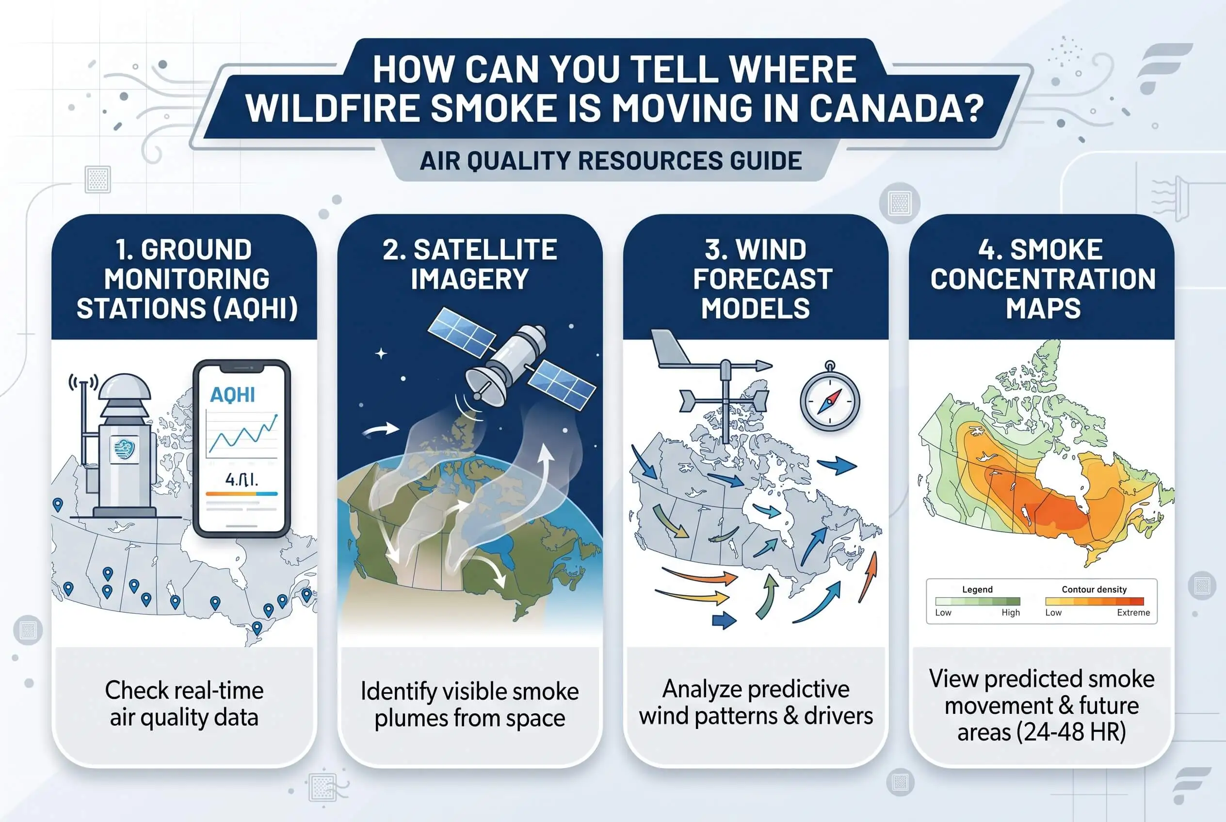
No single Canada wildfires smoke map does both jobs. Forecast maps model where smoke should travel over the next 72 hours. Observation layers report what monitors and satellites already recorded. Open one of each, and the gap between them tells you how many hours out the smoke is.
Forecast maps: the national smoke model, 72 hours ahead, published twice daily.
Observed readings: the Air Quality Health Index by community, refreshed hourly on a 1 to 10+ scale.
Fire layer: satellite hotspots and perimeter estimates, so you can confirm something is actually burning upwind.
When the two disagree: suspect timing before error. Work from the worst reading and look again mid-afternoon.
Top Takeaways
Forecast maps and observation maps answer different questions. One models the next 72 hours. The other reports what instruments are measuring right now.
When the two disagree, suspect timing before you suspect error. The smoke is usually on its way and hasn't reached ground level yet.
A clear map is not a promise of clean air. High-altitude smoke, satellite pass timing, and cloud cover all hide smoke from the model.
Terrain and inversions decide where smoke settles. Valleys and low basins trap it, and afternoon heating rearranges everything.
Check twice a day. Morning to plan, mid-afternoon to see what actually happened.
Let each tool do its own job. Observed index for health calls, forecast for planning, your own senses as the prompt to look again.
Where the numbers actually come from
Two systems. Two questions.
Satellites detect heat from active fires, and analysts trace the plumes they can see from orbit. That tells you where something is burning and roughly where the smoke is sitting in the sky. Ground monitors do the other job. They sit at fixed locations and measure fine particulate matter at breathing height, which is the number that describes what's actually going into your lungs.
So a satellite can track a plume drifting a kilometre over your roof while the monitor on your street reads perfectly clean. Both readings are right at the same moment. Once that clicked for me, most of my frustration with these maps went away.
Forecast or observation? Know which one you're looking at
Environment and Climate Change Canada runs a regional air quality model that maps where smoke should travel across North America over the next 72 hours. It publishes twice a day. That's a forecast, which means model output rather than a photograph of the sky.
The Air Quality Health Index does something else entirely. It reports what instruments are recording right now, community by community, on a scale of 1 to 10+, refreshed every hour.
When the forecast shows smoke and the index shows clean air, neither one has failed you. The model is telling you what it expects. The monitor is telling you what has arrived. Nine times out of ten, the gap between them is just timing, while broader air-quality protections under the Clean Air Act address a different part of the pollution picture.
Why a clear map doesn't mean clean air
This is the part I wish somebody had explained to me years ago, because three ordinary things hide smoke from the model.
Plume height. Light winds lift smoke high into the atmosphere, where it can ride hundreds or even thousands of kilometres from the fire that made it. High smoke turns the sun orange and the sky milky without moving a single ground monitor. Then conditions shift, that layer mixes downward, and the readings climb inside an hour.
Satellite timing. Fire detection depends on satellites passing overhead on a schedule. A fire that ignites or blows up after the last pass won't appear until the next one, and neither will its smoke.
Cloud cover. Put a cloud between the satellite and the fire and the detection simply never happens. The smoke from that fire is missing from the model entirely.
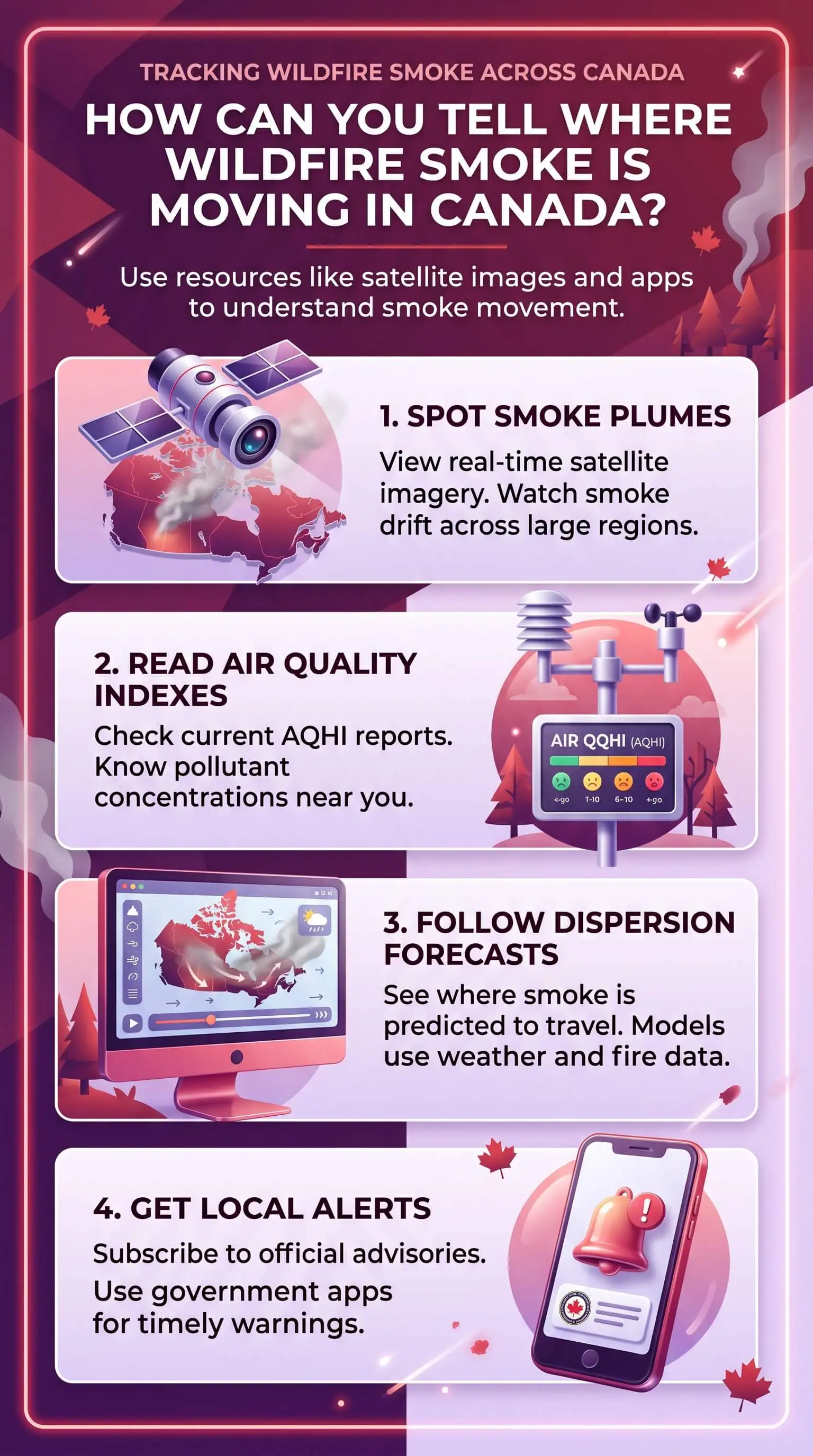
Which is why I quit relying on any single source. A live Canada wildfire and smoke map that stacks active fire detections and analyzed smoke plumes on one screen tells me quickly whether what I'm smelling has a plausible source upwind. That context is worth more than any one color on any one map.
Wind carries it, terrain decides where it lands
Wind moves fine particulate matter over long distances. Terrain decides where it finally settles. Valleys and low-lying basins trap cool air overnight and pollutants pile up inside it, because that air has nowhere to rise. A temperature inversion pulls off the same trick on flat ground, with warmer air sitting on top like a lid, holding smoke down at the level where your family breathes.
Which is why afternoons behave nothing like mornings. Surface heating breaks the inversion, the air mixes, and smoke that was overhead comes down while smoke that was trapped finally disperses. So I checked twice. Once in the morning to plan the day, and again around three o'clock to find out what really happened.
When the map and your own nose disagree
Here's the rule I settled on, and it hasn't let me down yet.
Health decisions: go by the observed index, never the forecast.
Planning tomorrow or the day after: go by the forecast.
Your own eyes, nose, and throat: treat them as a tie-breaker that means check again, not shrug it off.
If you can see or smell smoke and the map disagrees, the map is far more likely to be behind than wrong. Work from the worst of the two readings until the next update, keep the windows shut, and let well-maintained HVAC home air filters help keep indoor air cleaner while conditions outside change. Look again in a couple of hours. You're the one looking out for everybody under your roof, and that call belongs to you.
“The mistake I run into most often is people treating a smoke forecast map like a live camera. It's a model running on a fixed schedule, so when it disagrees with what you can smell in your own driveway, the useful question isn't which one is lying. It's how many hours behind the model might be.”
7 Essential Resources
Watch where the smoke should travel over the next three days
FireWork air quality model forecast maps from Environment and Climate Change Canada animate expected smoke movement across North America, hour by hour, 72 hours out. Just keep in mind what you're looking at. These publish twice daily and they model what's coming, rather than reporting what's here.
Find the fire behind the plume before you read the forecast
Natural Resources Canada runs the Canadian Wildland Fire Information System interactive map, which shows active fires, satellite hotspots, perimeter estimates, and fire weather layers. I open this one first when smoke shows up. Knowing whether something is actually burning upwind of me changes how seriously I take everything else.
See what your community's air is doing right now
The Air Quality Health Index forecasts page reports conditions by community on that 1 to 10+ scale. This is the observation side of the ledger. It's the number I use for any decision that affects somebody's breathing, and it's the one I'd bookmark first.
Understand what those readings mean for your household
Wildfire smoke, air quality and your health from Health Canada explains what each index category means in practice and who tends to feel the effects first. If you read one page from this list properly instead of filing it away, make it this one.
Get the house and the car ready before the season starts
Preparing for wildfire smoke events is the practical checklist. Medications on hand, properly fitted respirators, the highest quality filter your ventilation system can handle, spares on the shelf, and a fresh cabin filter in the vehicle. Every one of those jobs is easier in April than it is in August.
Cross-check southbound drift where the sensors are thickest
The US Environmental Protection Agency and the US Forest Service jointly run the AirNow Fire and Smoke Map. When smoke heads toward the border, it often carries more ground sensors per square kilometre than anything on the Canadian side, which makes it a genuinely useful second opinion on how far a plume has come.
Read the national fire picture in one dated report
The Canadian Interagency Forest Fire Centre publishes national situation reports covering preparedness level, fire statistics, and how crews and equipment are moving between agencies. Read the dated report rather than the homepage counters, which can come to you from cache.
Use FireWork and CWFIS to track where wildfire smoke may travel, AQHI and AirNow to understand what people are breathing now, Health Canada for practical exposure guidance, and CIFFC for the national fire picture; broader public-health context, including U.S. cities have the highest percentage of adults who smoke, should remain a separate consideration rather than be confused with what wildfire smoke maps and forecasts actually measure.
3 Statistics
More than 2,500 weather stations feed Canada's daily fire maps. Natural Resources Canada reports that the Canadian Wildland Fire Information System pulls from over 2,500 stations across Canada and the United States, plus satellite detection and fire reports from provinces, territories, and national parks. It has produced daily national maps since 1994.
Smoke forecasts run 72 hours out, hour by hour. Environment and Climate Change Canada states that its regional air quality model produces hourly forecast maps across North America for the next 72 hours. The same page notes that light winds can lift smoke high enough to carry it hundreds or thousands of kilometres from its source.
For some smoke pollutants, no exposure level is known to be safe. Health Canada names fine particulate matter as the main health risk in wildfire smoke and states there's no known safe level of exposure for some of the pollutants it carries. Air quality can be poor even when you can't see or smell a thing.
Canada's wildfire monitoring network draws on more than 2,500 weather stations, while smoke forecasts can project conditions up to 72 hours ahead and health agencies warn that some wildfire pollutants have no known safe exposure level, making tools such as indoor air quality testing useful for understanding what smoke may be affecting the air inside your home.
Final Thoughts and Opinion
My honest position is that these maps deserve far more credit than they get, and that nearly every complaint I hear about them turns out to be a complaint about interpretation.
The forecast was never built to tell you what the air is like this second. The index was never built to tell you what tomorrow holds. Stop asking either tool to do the other one's job and they stop contradicting each other, which is the whole trick. Given the choice, I'd take two imperfect maps that disagree in a way I understand over one confident map that quietly hides its own uncertainty.
The habit that changed things for me was small enough to feel silly. Check in the morning, check again mid-afternoon, and believe the worse of the two numbers until something proves otherwise, then use that reading to decide whether your indoor setup, including top air filters, needs attention.
Frequently Asked Questions
How often do Canadian wildfire smoke maps update?
The national smoke forecast maps publish twice a day and show expected hourly conditions for 72 hours ahead. Observed air quality readings refresh every hour. Fire detection runs on satellite passes, so a new or fast-growing fire can take hours to turn up on any map at all.
Why do two official smoke maps show different conditions?
Because they're measuring different things. Forecast maps model where smoke should go, while observation layers report what monitors and satellites have already recorded. Add different update schedules and different coverage areas on top of that and the two will rarely line up exactly.
Can wildfire smoke reach me if there's no fire nearby?
Yes. Health Canada notes that wildfire smoke can travel thousands of kilometres from the fire zone, so your air quality can suffer with no active fire anywhere near you. Light winds are the culprit more often than strong ones, because they loft smoke high enough for the long haul.
What Air Quality Health Index level should change my plans?
The index runs 1 to 10+, and higher means greater health risk. Follow the guidance attached to your local reading and any air quality alerts issued for your area, and consider air ionizer installation as part of a broader indoor air-quality strategy when smoke conditions worsen. If anyone in your household is in a group more likely to be affected, act earlier than the number alone suggests.
Does a clear map mean the air outside is clean?
Not reliably. Smoke sitting high overhead can discolor the sky without registering on a ground monitor, and an undetected fire won't appear in the forecast at all. Smell smoke? Trust that, and check again in a couple of hours.
How far ahead can smoke movement actually be forecast?
Roughly three days. The national air quality model publishes hourly smoke forecasts across North America 72 hours out. Confidence falls off the further you look, because fire behaviour and wind both keep shifting underneath the model while it runs.
Which map should I open first during a smoke event?
Start with the fire map to see whether a source sits upwind. Then the smoke forecast, for where that smoke is headed. Finish with your local air quality index, which tells you what has already arrived on your street. In that order, the three explain one another.
Follow the Smoke Before You Try to Read It
Open a fire map, a smoke forecast, and your local air quality reading side by side, and the question of where wildfire smoke is moving stops being a guess. Check all three again in the afternoon, because the answer will have moved, and use that changing air-quality picture to decide whether indoor measures like MERV 8 pleated HVAC furnace air filters belong in your broader smoke-control strategy.